
Custom Menus
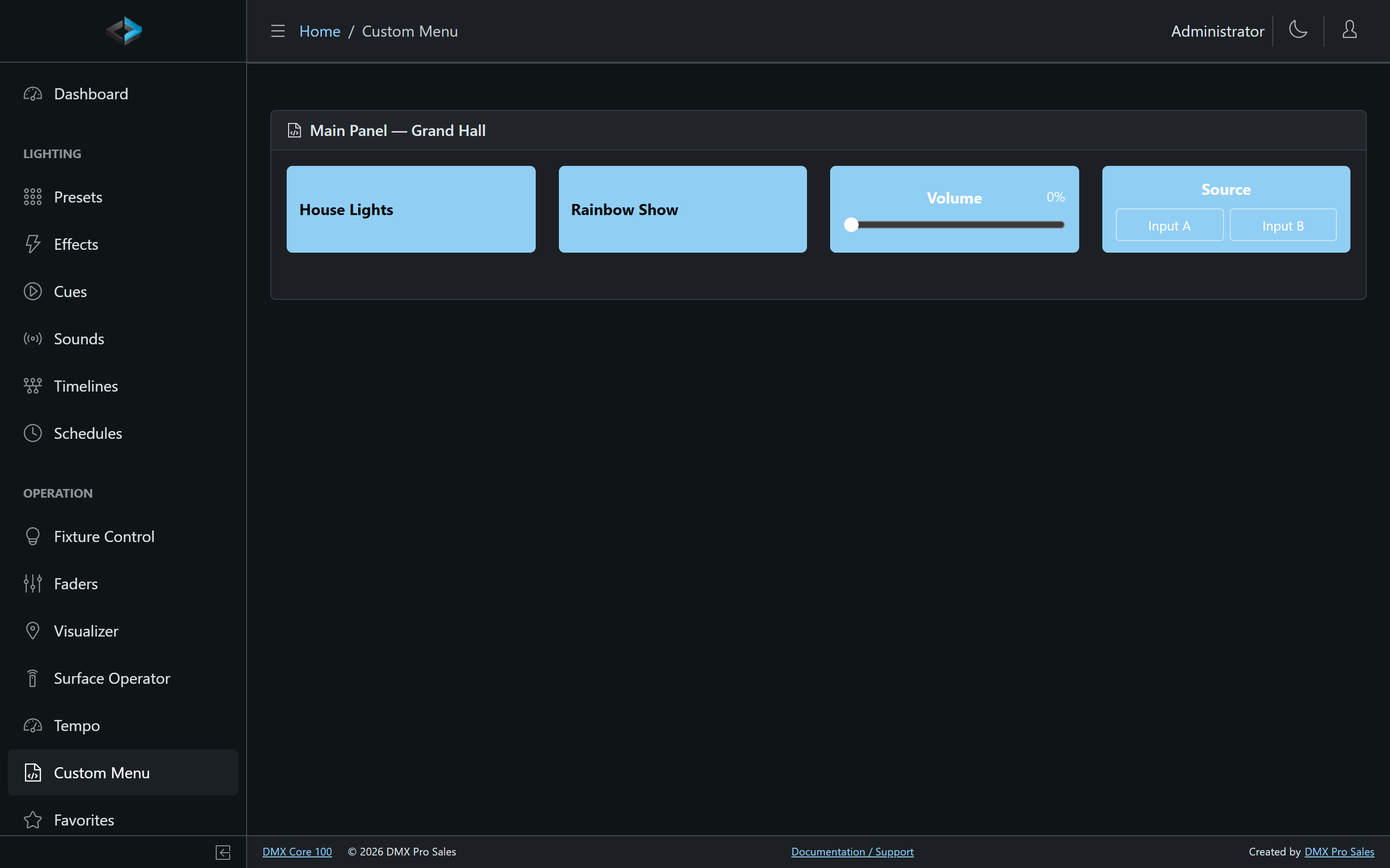
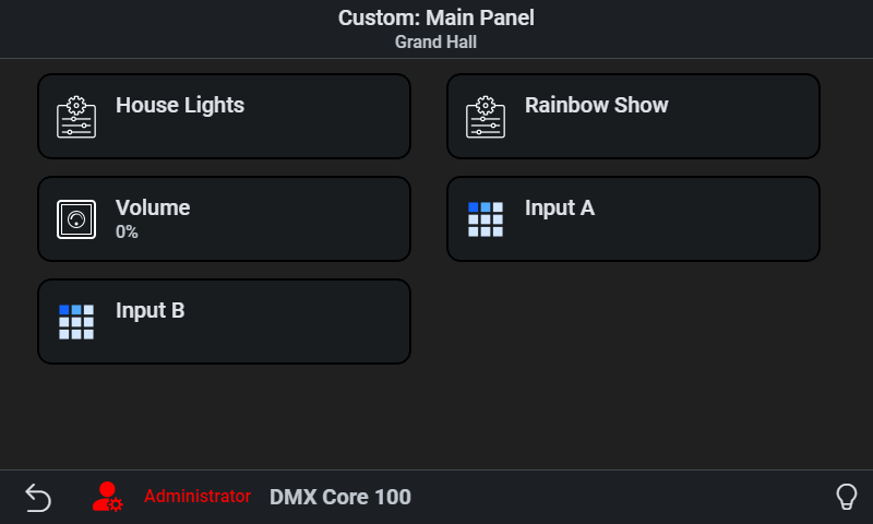
Custom menus are simplified, purpose-built control panels. Instead of exposing the full system, you present end users with just the controls they need - buttons for specific scenes, a volume slider, a source picker. Menus appear on the touchscreen, in the Web UI (under Operation > Custom Menu), and - when enabled - to guests in the browser without logging in.
You can create multiple menus, each with its own items, look, and audience. They are especially useful in lock-down mode, where a custom menu is the only interface available on the device.
Managing Menus
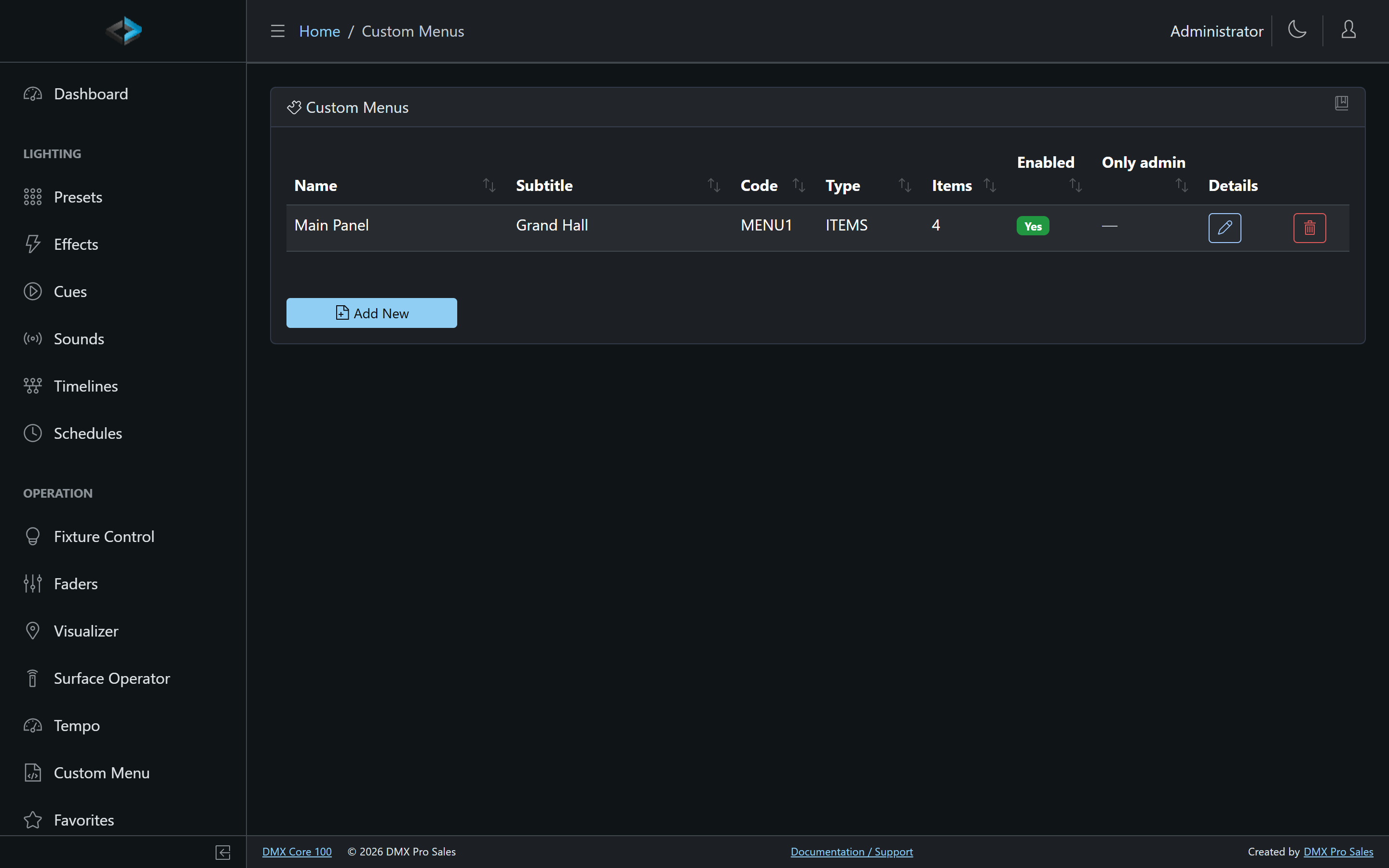
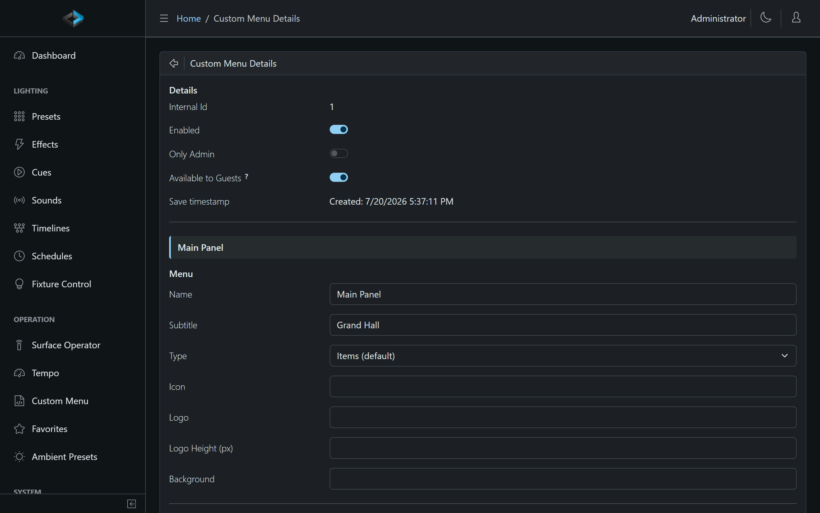
Menus are designed under Control & Integrations > Custom Menus in the Web UI. Each menu has:
- Code - a short unique code (auto-generated, e.g.
MENU1, but freely changeable) used for direct links - Enabled - turn the whole menu on or off
- Only Admin - restrict the menu to admin users
- Available to Guests - expose the menu in the Web UI without login, so anyone on the network (or a wall tablet) can use it
- Type - Items (buttons, the default), Items (small view) for compact lists, or Faders (columns of sliders)
- Look - icon, header logo with height, and background
Menus can be exported and imported as JSON - see the custom menu samples on GitHub for ready-made layouts.
On the touchscreen, open a menu from Main Menu > Utilities > Custom Menu. If Only show custom menu is on (Device > System), non-admin users start on the custom menu; admins are exempt.
Menu Items
Click Add item in the editor. Each item has a name, optional subtitle/description, icon, background color, and one of these types:
| Type | Description |
|---|---|
| Action | A button that triggers an action (see below) |
| SubMenu | Opens a nested menu level |
| Slider | A fader. The Slider target panel sets the target - for a DSP level pick Control Value (Level) and the Control Value from the dropdown |
| Segmented selector | A source/input picker bound to a Selector Control Value |
| Value display | A read-only live readout of a Control Value of any kind (see below) |
| Presets / Cues list | A browsable list of presets or cues (touchscreen only) |
| Scene Panel | Opens the Scenes page: scene tiles with a color wheel and dimmer (Web UI only; the touchscreen leaves this item out) |
| OSC direct message | Send a raw OSC message when tapped |
Value Display
A Value display item shows a Control Value without offering to change it: a scoreboard’s HOME 14 / AWAY 7 next to the keys that step the scores, or the bar volume beside an Up/Down pair. Pick the Control Value; the item prints a Level as a percent, a Counter as its number, a Selector as its choice and a Toggle as On/Off, and follows the value live wherever it is changed from. On the web the value sits big under the item’s name; on the touchscreen the value is the card title with the name beneath it. The optional Format uses the same syntax as a Stream Deck key’s value format: {0} is the value, {1} the default text, so {0} pts reads “14 pts” and Vol {0:P0} reads “Vol 63%”; for a Toggle, Yes|No names the two states.
Actions
An Action item can: Apply Ambient Preset, Apply Preset, set/step a Control Value, Fade Out, Fire Output Event, Play Cue, Play Sound, Play Timeline, Run Script, Step Effect, Stop or Blackout, Tap Tempo, Audio Mute, DMX Output, or Toggle Schedule.
Per-item options:
- Press mode - Normal, Toggle on/off, or Flash (hold) - active only while the button is held
- Fade-in / fade-out time and loop count - override the item’s playback settings
- Dimmer - playback brightness for this button
- Require confirmation - ask before executing. Control surface buttons use Hold to confirm instead of a dialog (the Surface Operator still asks Yes/No)
- Live state - highlight the item while a Control Value equals a given value (e.g. light up “Input B” while that source is selected), or automatically while its own action is active
Menu Structure
Menus support multiple levels via SubMenu items - a top-level menu with a button per room, each opening that room’s scene options. A glow state indicator shows items whose target is currently active.
Guest Access
A menu marked Available to Guests can be used from a browser without logging in - ideal for a lobby tablet or letting staff trigger scenes from their phones without handing out PINs. Guests see only guest-enabled menus; everything else still requires a login. A Scene Panel item on a guest menu opens the panel for guests only when Scene Panel available to guests is on in System settings (see Scenes).
Direct Links and QR Codes
Every menu has a code that opens it directly by URL - perfect for a QR code posted at the site, a wall-tablet home page, or a browser bookmark:
http://<device>/guest/custommenu?code=LOBBYhttp://<device>/op/custommenu?code=LOBBYThe guest/ form works without login for menus marked Available to Guests; the op/ form is for logged-in users. Codes are matched case-insensitively and stay stable even as you rename or reorganize the menu, so printed QR codes keep working. The menu editor shows ready-made direct links next to the preview link once a code is set.
Favorites
Favorites are a Web UI list (Operation > Favorites). They are not shown on the touchscreen home screen.