
Configuring a Surface
Open a surface from Control & Integrations > Control Surfaces to edit it. The editor shows the live device connection status at the top, and is organized around three concepts: banks, sections, and assignments.
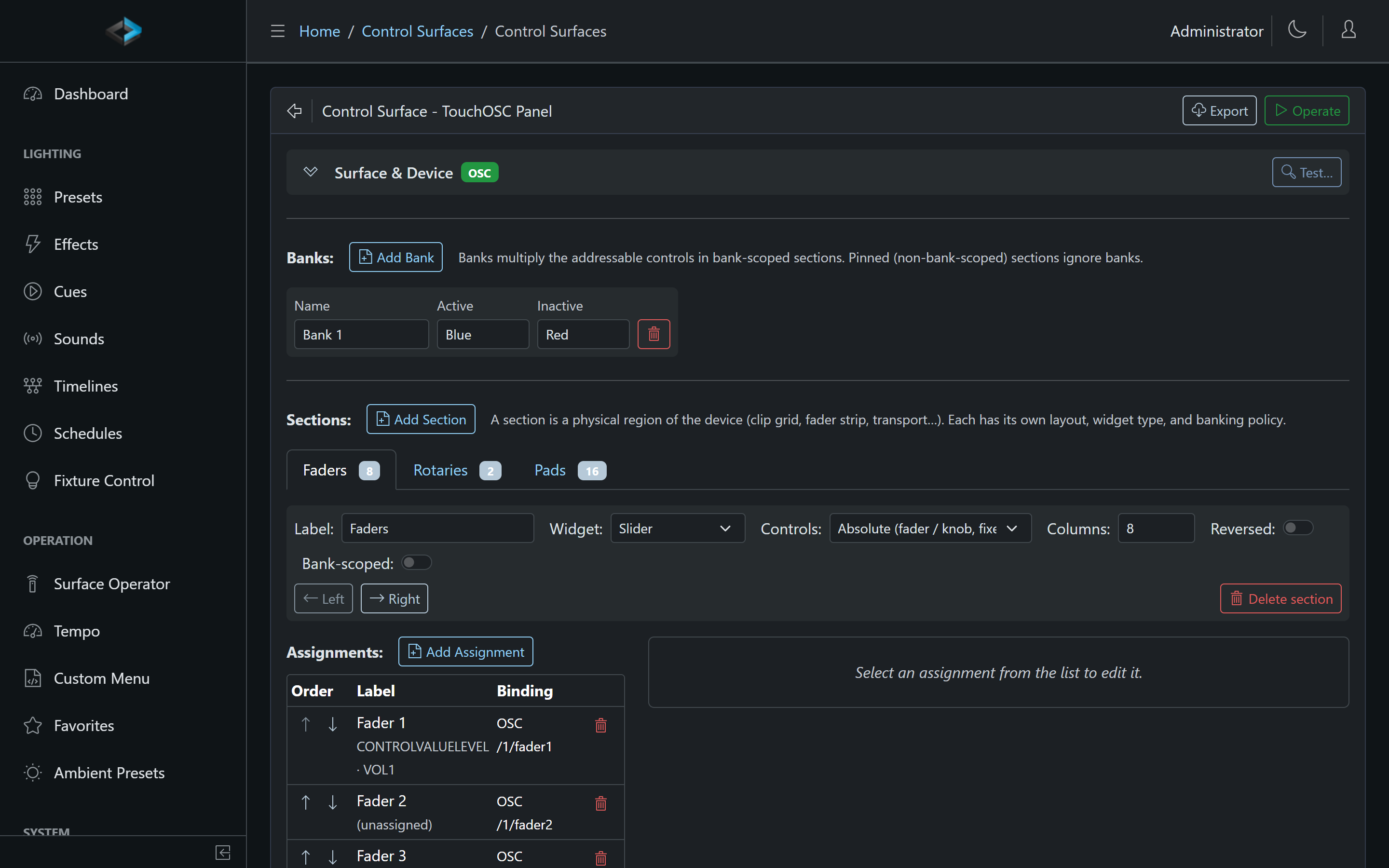
Sections
A section is a physical region of the device - a pad grid, a row of knobs, a fader strip. A Stream Deck +, for example, has three sections out of the box: Buttons (8 pads), Knobs (4 controls), and Knob Presses (4 pads).
Each section has:
- Label - a name for the region
- Widget type - Pad (buttons) or Slider (levels)
- Columns - the grid layout, plus a Reversed option for devices numbered the other way
- Bank-scoped - whether the section participates in banks (see below)
Banks
Banks multiply the addressable controls on a small device: each bank holds its own set of assignments for every bank-scoped section, and switching banks swaps them all at once. A 8-pad device with 4 banks gives you 32 buttons.
- Each bank has a name and active/inactive colors, used for bank indicator feedback (and shown on the Stream Deck + LCD strip)
- Sections marked pinned (not bank-scoped) keep the same assignments in every bank - ideal for a master volume knob or a global stop button
- Bank switching is itself an assignable action (Next Bank / Switch Bank), and on the Stream Deck + you can also swipe the LCD strip
Assignments
Click a control in the section grid to edit its assignment:
- Label - the text shown on LCD keys and in the operator view
- Action - what the control does. Available action types: Apply Ambient Preset, Apply Preset, Control Value (set / up / down), Fade Out, Fire Output Event, Next Bank / Switch Bank, Play Cue, Play Sound, Play Timeline, Run Script, Step Effect, Stop, Blackout, Tap Tempo, Audio Mute, DMX Output, and Toggle Schedule
- MIDI Binding (MIDI surfaces) - Note, Control Change, or Program Change; channel 1–16; number 0–127; Learn captures the next MIDI message. Assignments without a binding show Web-only - no MIDI binding
- Press mode - Normal, Toggle on/off, Flash (hold), or - for Play Timeline actions - Momentary (release continues past a Hold milestone). A Control Value action’s Follow input operation is held-style on its own: the Toggle is On while the key is held and Off on release
- Hold to confirm - the operator must keep the button pressed before the action fires (see below)
Hold to confirm
Turn this on for actions that would be costly to hit by accident - Blackout, Toggle Output, Stop, and similar. The operator keeps the button down for the duration set under Device > System → Control surface hold to confirm (ms) (default 1.5 seconds, 250–10000). Releasing early cancels; the action never fires.
While the button is held:
- Stream Deck - a ring sweeps around the key and the face darkens until the hold completes
- Key Digital KD-WP8 - the LED blinks red / off
- Akai LPD8 mk2 - the pad blinks
- Surface Operator in the browser - a Yes/No dialog instead of a hold, the same prompt custom menus use for Require confirmation
The option is disabled (with a reason) when the assignment already uses a hold gesture or has no release edge: Flash, Momentary, Control Value Up/Down, MIDI Program Change, OSC Toggle, and Stream Deck+ encoder-press buttons. Custom-menu Require confirmation is separate and unchanged.
Appearance and LED feedback
Each assignment also controls how the button looks and how its LED behaves:
- Icon - an icon name (e.g.
play,stop); leave empty for text-only buttons - Font size - negative values render bold; set to 0 with an icon for icon-only keys
- Background - Active - shown while the action is engaged (preset playing, schedule on, mute on) or briefly during a tap-flash
- Background - Inactive - shown while the action is at rest
Colors accept names (Blue, Red, Green, …) or hex codes (#FF0000). On devices with simple LEDs (like the KD-WP8), the active/inactive colors map to the nearest LED state.
Live Values on a Stream Deck
A Stream Deck key whose action is a Control Value shows the value on the key face, under the label: a Level as a percent, a Selector as its choice, a Toggle as On/Off, a Counter as its number. The face updates as the value changes, whoever changed it, so an operator stepping a score or a volume from the deck always sees where it stands. Keys with an icon show the value on a band across the bottom of the icon. A Toggle key lights while the value is on, and a Set value key lights while the value is what it sets, the same way a preset key lights while the preset is active.
Each key (and each dial) has a Show value switch and an optional Format. Turn Show value off for a key like “Reset” where the number means nothing. The Format is a .NET-style format string: {0} is the value (a Level as 0–1, so {0:P0} prints a percent; a Counter as its number; a Selector as its choice; a Toggle as On/Off) and {1} is the default text, so Vol {0:P0} reads “Vol 63%” and {0} pts reads “14 pts”. Spreadsheet-style number patterns work inside the braces too: {0:0.0%}, {0:00}. For a Toggle, Yes|No names the on and off texts. A format that does not fit the value falls back to the default text.
On a Stream Deck +, the LCD strip splits into one segment per dial once any dial drives something: the dial’s label on top and its live value below. A dial can drive a level as before (Control Value (Level), a fixture, a zone, the master, the volume) or, with the Control Value (step per tick) target, step a Control Value of any kind: each click is one Up or Down, so a Counter counts and a Selector cycles. Two dials on HOME and AWAY counters and the strip reads HOME 14 | AWAY 7. Inverted swaps the direction. A dial press stays a normal button (Knob Presses section), so a press can reset a score with Set value 0.
Testing Your Layout
You don’t need the physical device in hand to build a layout - click Operate at any time to drive the surface from the browser. See Surface Operator.